![]()
Case Study Overview
To improve upon the existing website’s ease of use, and to attract new millennial donors, NAMI Austin requested our UX Applied Lab team to work on their project. National Alliance on Mental Illness = NAMI
Problem Definition
NAMI Austin web site is difficult to navigate. Some of the hierarchy and language is confusing to users. A visual refresh is necessary to attract the type of audience they need, as well as to improve info architecture, nav simplicity, and discoverability.
Success for our project could be the comparison of two tests: At the beginning of the project, a teammate conducted a “tree test” on the original NAMI Austin website. Success for our project would be defined by the “tree test” conducted at the end of the project by the teammate who discovered 85% success rate.

Audience
Target users comprise the individuals who currently use the site, staff or volunteers at NAMI, as well as potential users such as military with PTSD. We did not create a persona this time. We arrived at this assumption of target users based upon information gleaned through meeting with NAMI clients and perception.
Team / Role
Team comprised four people. Eventually, one person stepped away from the project and we regrouped as a team of three.
At the beginning of the project when roles were assigned, it was determined that I was strongest in visual design. I used Adobe XD, Photoshop, Sketch, and InVision. I also dove in to assist with the UX research. A UX generalist and a UX researcher comprised the rest of the team.
Constraints
The project deliverable date determined our timeline for completion of each phase. Our initial client meeting was January. We had access to users by appointments for interviews and card sorting. We had access to clients by weekly online meetings and two in-person meetings. We also had the constraint of being limited to a selected WordPress theme chosen by a developer who we never met.
Design Process
My process, other than user interviews, was Heuristic Analysis of the original web site and research of millennial best practices in current web designs, and creating a couple of mood boards. A mood board is created to provide the team and client options and insight on how artwork might look and feel. Typically mood boards combine color, text, and images, to help the team and client understand a graphical direction.
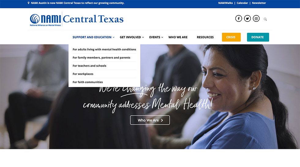
I also assisted in User Interviews and co-led Card Sorting Analysis. I created the initial mockup that presented one possible new nav structure. The first mockup was messy, gray, and misunderstood. The visual design comps were neat, designed using the brand colors, and understood. I included full screen designs, tablet screens, and mobile telephone-sized screens. As far as design exercises, I analyzed attributes on the clients’ favorite web sites and shared this analysis for the team’s knowledge base.
Retrospective
Although a personalized design was created for the client, at the end narrow limitations of the WordPress theme became the quick visual refresh design solution at the end. In retrospect, the Card Sorting Analysis step could have been skipped or scheduled earlier on a smaller scale, as it was not a smooth process. To explain, the Highland Campus shut down due to a water leak and the Veterans Affairs coordinator was on vacation and never received my request for volunteers. What I would do better if I could do it again would be to ask the clients some pointed questions about their vision of an improved nav structure.
The new website URL is: NAMIcentraltx.org
I shared in researching and the conducting of user interviews to gain insight of how best to make the site more user friendly. I conducted heuristic analysis of each page of the old web site as well as compared attributes of the clients' favorite web sites to design new landing page mockups. I am recommending certain new photos to replace the old.


